UI Design, Art Direction
Supreme UI - Tech wear
Red & white brutalism. A school project where the goal was to create a user interface inspired by the brutalism movement. I decided to use the Supreme brand. I animated interactions in Adobe After Effects for micro-interactions. I also worked the art direction and the sound design so it can fit with the spirit of the brand.
Company
School project
Date
Oct 2020
Team
Karim Manaa - Art Director, UI Designer
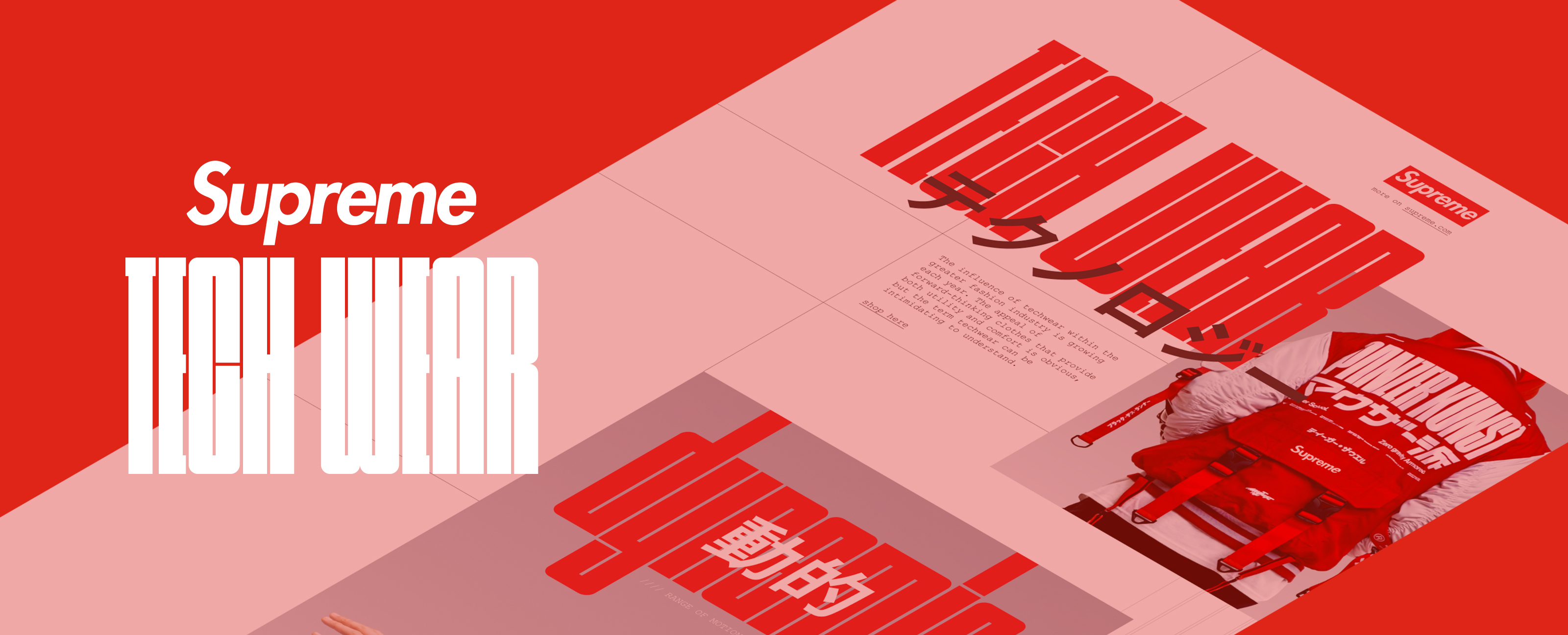
I wanted to create an interface for a fake techwear collection of the Supreme brand. I was inspired by the brutalism movement. Techwear has been created by the underground and streetwear. If the origin is a little bit blurred, we can find sources in the United States and Japan. I wanted to mix both cultures.
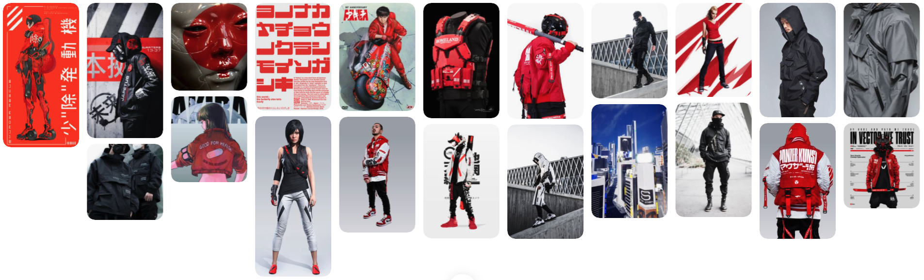
Moodboard. You can open the moodboard here.
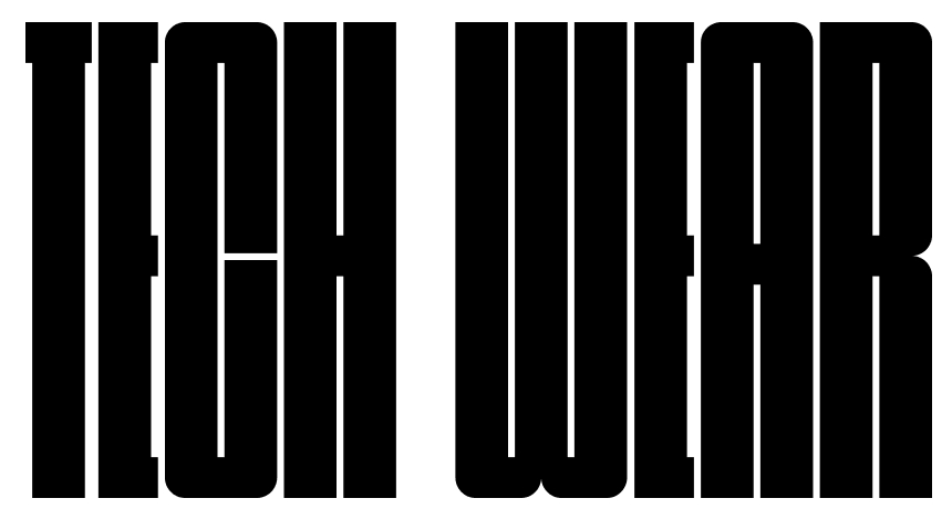
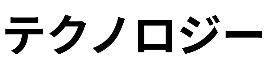
Used fonts : Nagasaki & Courier New (the current Supreme font).
The goal was to find street and brutalism vibes in the interface. Nagasaki is a very large font, it makes you think about streets and road signs.
Courier New brings that heavy brutalism atmosphere. It's one of the most functional typo. From typewriter, it was created for one goal : to be written on a paper.
Straight to the need : be functionnal.
Sound design is a very important part for an art direction, that's why I choose a music to go with the presentation.
Mock-up and final video (turn up the volume plz). You can see UI kit, wireframes & final design here.